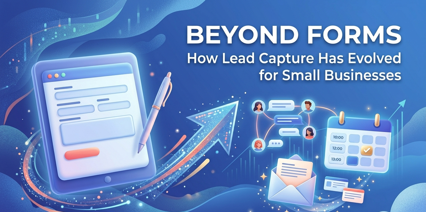
.jpg)
A visitor lands on your website. They've looked at your services, they're comparing options, and they're ready to reach out. Then they see a contact form. Name, email, message, submit. Maybe they fill it out. More likely, they close the tab and call whoever came up second on Google.
This is how small businesses lose leads every day. Not from bad ads or weak offers. From friction at the exact moment someone decides to get in touch.
Lead capture for small business has changed a lot in the past few years. The businesses booking more jobs from the same traffic have moved past forms. They're using tools that respond to visitors in real time, qualify them automatically, and push toward a booking before the visitor has a reason to look elsewhere.
This article covers what that shift looks like and how to do it without overhauling everything at once.
Why Lead Capture Forms Have Become a Liability
Forms made sense when they were built. They're easy to set up, they collect structured data, and they give the business a record of who reached out. That's still true. The problem is everything that happens around them.
A form asks for effort without giving anything back. The visitor has to type out their situation, hit submit, and then wait. They have no idea when someone will read it, whether their message landed, or if they'll get a response today or next week. For someone who found your site because they need a plumber or a roofer or a cleaning crew, that uncertainty is enough to make them look for someone else.
Lead capture forms also fail completely after hours. Most service inquiries don't happen between 9 and 5. Someone deciding to repaint their house on a Saturday afternoon, or a homeowner whose AC stopped working at 8 p.m., is not going to fill out a form and wait until Monday. They want to know if you're available and what it costs. If your site can't tell them, someone else's will.
Industry research on UX-first lead capture consistently describes static forms as high-friction. Buyers expect immediate responses, especially on mobile, and forms by design cannot deliver that. Smarter lead capture analysis backs this up: static contact forms interrupt the visitor's momentum at the exact moment intent is highest. The conversion rates reflect it. Forms that used to pull in 15 to 20 percent of visitors a decade ago are converting a fraction of that now, and the gap keeps widening as buyer expectations keep rising.
What Modern Lead Capture Strategies Actually Do
Good lead capture strategies today focus on three things: speed, conversation, and qualification. The goal is still the same — get contact information and move the prospect toward a booking. The method is completely different.
Instead of asking for contact details upfront, modern tools start with a question. What service are you looking for? What's the issue? Where are you located? The visitor answers because it's easy and because it feels like the first step toward getting help. Contact information gets collected mid-conversation, after the visitor is already engaged.
These tools run around the clock. A prospect who hits your site at 11 p.m. gets the same immediate response as one who arrives at noon on a Tuesday. That alone changes the math on how many leads you capture from existing traffic.
They also qualify leads in real time. Good lead capture software figures out whether someone is ready to book, still comparing options, or outside your service area, and it routes them accordingly. That work used to require a human on the phone. Now it's handled automatically before anyone on your team gets involved.
The best version of this ends with a booked appointment, not a form submission in an inbox. The difference between those two outcomes is significant.
Live Chat Lead Capture Has Changed Completely
If you set up a chatbot a few years ago and shut it off because it frustrated visitors, that experience is outdated. The technology is genuinely different now.
Early chatbots ran on decision trees. They asked a fixed set of questions in a fixed order, and if the visitor said anything outside the script, the bot broke down. Most small business owners gave up on them for good reason.
Live chat lead capture today runs on AI. Tools like Small Business Chatbot use language models that understand context and handle real conversations. A visitor can ask a follow-up question, change direction, or ask something the builder never anticipated, and the agent responds accurately and keeps moving toward a booking.
The practical difference: a scripted bot falls apart the moment someone asks "Do you do commercial jobs too?" An AI agent answers the question, logs the commercial intent in the lead record, and continues the conversation. A form collects an email and waits. An AI agent can ask when the visitor wants a callback, check the calendar, and book the appointment in two minutes at any hour.
Salesforce's 2026 lead generation guide ranks AI chatbots, live chat, and automated lead routing among the top tools for capturing and qualifying inbound leads, noting they help businesses identify high-intent prospects and personalize outreach faster than any manual process.
Small businesses that adopt these tools now are simply going to capture more leads than competitors who are still relying on forms and next-day email follow-up.
The Cost of Slow Response Times
Picture this: a prospect fills out a contact form at 2 p.m. on a Tuesday. The owner sees it at the end of the day, sends a reply at 5 p.m., and tries calling the next morning.
The prospect booked with someone else the night before.
This happens constantly. Response time is one of the strongest predictors of whether a lead converts, and the first business to respond has a real advantage. The problem for small businesses is that fast response during business hours is hard, and fast response after hours is close to impossible without automation.
Automated follow-up solves this. When a lead comes in through chat or a form, an SMS or AI voice call can go out within seconds. The prospect hears from you before they've had time to call the next business on their list. Small Business Chatbot's AI Follow-Ups handles this automatically — following up by SMS, email, and AI voice so every lead gets a fast response regardless of when they came in or what your team is doing at that moment.
What to Look for in Simple Lead Capture Tools
Forms stuck around partly because they're easy. Embed a snippet, connect to an email address, done. The concern with more capable tools has been setup time and complexity.
That concern is less valid than it used to be. The best simple lead capture tools today are built for small businesses without technical staff. Here's what actually matters when evaluating them.
Setup speed. Getting live on your site should take an hour, not a week. If the tool requires a developer or a lengthy onboarding process, it's built for enterprises, not small businesses.
Built-in qualification. The tool should sort leads by intent on its own. You should not have to build a decision tree from scratch. Service businesses in trades, home services, and professional services need qualification flows that match how their customers actually communicate.
Calendar booking. This is the most important integration. If the chat can put an appointment directly on your calendar, the conversion happens in real time. Without this, you're back to trading messages and waiting.
CRM sync. Every lead should land in one place with the full conversation attached, not just a name and email. Small Business Chatbot's Lead Management CRM tracks leads with AI scoring, follow-up triggers, and pipeline visibility so nothing gets lost between the first contact and the close.
Automatic follow-up. The tool should handle subsequent outreach without your team having to remember to do it. Leads that go cold between the first and second contact are a solvable problem.
A Practical Path to Modernizing Your Lead Capture
You do not have to replace everything at once. Most small businesses can improve their lead capture significantly by adding a few tools on top of what they already have.
Start with an AI chat widget on your website. This is the change with the most immediate impact. A chat agent that holds a real conversation, answers service questions, and guides visitors toward a booking will pull more leads from your existing traffic than any form.
Connect it to your calendar. Cut out the back-and-forth. When chat can book the appointment directly, the conversion happens in the moment instead of depending on a series of follow-up messages.
Automate follow-up for visitors who leave without booking. Some people need a few days. A follow-up sequence by SMS and email, triggered automatically, keeps you in front of those prospects without any manual effort.
Use AI workflows to handle the handoffs. When a lead comes in from any channel, it should update your CRM, notify the right person, and trigger the next step on its own. Small Business Chatbot's AI Workflows handle this automatically so leads move through your process cleanly instead of sitting idle between tools.
Audit where leads are actually dropping off. If you're getting traffic but not leads, the issue is friction at the capture point. If you're getting leads but not bookings, the issue is response time or follow-up gaps. This guide on why prospects stop converting on your site is a useful place to start that audit.
A Real Example: Roofing Company Replaces a Form
A roofing company ran a contact form for five years. They got a few submissions a day. Conversion to booked jobs was low and inconsistent, and it was hard to tell why.
They replaced the form with an AI chat widget. Visitors who previously bounced because they had a question the form couldn't answer started engaging instead. The AI agent answered questions about service areas and pricing, collected contact information, and booked free estimates directly into the owner's calendar during the conversation.
Leads that didn't book right away got an automated SMS within five minutes. A second follow-up went out the next day. By the third message, most of the viable leads had booked or responded.
Nothing changed about the offer, the pricing, or the traffic. What changed was the experience between landing on the site and taking action. That's what lead capture strategies are actually about.
Covering All the Channels That Matter
Leads come in from multiple places. Some visitors use chat. Some call. Some submit that old form on a landing page you haven't touched in two years. The question is whether your system handles all of them consistently.
Most small business setups handle one channel well and let the others leak. Calls go to voicemail after hours and nobody follows up until morning. Chat leads sit unread. Form submissions get a reply two days later when someone remembers to check.
Small Business Chatbot covers chat, phone via the AI Answering Service, SMS, email, and AI voice in a single platform. Every lead, regardless of how they came in, gets a fast response and a clear next step. Businesses that can do this across all channels convert more from their existing traffic. Not because they're spending more on marketing, but because they're losing fewer people who were already interested.
The Bottom Line on Lead Capture for Small Business
Static forms made sense for a different era of the web. Buyers expected to wait. Competition was less immediate. A next-day email follow-up was acceptable.
That's no longer how it works. Buyers have more options, shorter patience, and no particular reason to wait for you when a competitor responds in two minutes.
The shift to AI-powered, conversational lead capture for small business is already underway. The tools are accessible, setup is faster than it used to be, and the businesses using them are quietly pulling leads away from competitors who are still sending "Thanks for contacting us, we'll be in touch soon" autoresponders.
Updating your lead capture is one of the higher-leverage things a small business can do with its existing traffic. The leads are already there. The question is how many of them you're actually catching.
Small Business Chatbot helps service businesses capture leads, qualify visitors, and book jobs automatically. See how it works for your business.
Related Resources:
- AI Chat Widget for Small Businesses
- AI Follow-Up Automation
- Lead Management CRM
- AI Workflows
- Why Prospects Stop Converting on Your Site
- AI Answering Service
![MyAIFrontDesk Alternatives [2026]](https://sbc-publicv1.s3.amazonaws.com/cms/og-images/articles/myaifrontdesk-alternatives/aea6c2b3-a96b-40dc-b162-a19ca7bda192.png)